edX: Revenue Optimization
Designing for Sustainability at a Mission-Driven EdTech Platform
Executive Summary
As lead designer on edX's Rapid Experimentation team, I designed a series of upgrade interventions over three years that generated $37M+ in attributable revenue, helping a mission-driven nonprofit move toward financial sustainability without compromising its commitment to free, open education.
+$37M
Attributable revenue
+35%
Conversion increase
200+
Research studies
Project Overview
Timeline: December 2016 – January 2020 (3 years)
Team: Product Manager, Engineers, reporting to CPO. UX supervision from the Head of UX.
My Role as Lead Designer
End-to-End Design Ownership: Sole designer on the Rapid Experimentation team. Owned the entire design process from research through implementation, conducting user interviews, creating prototypes, running usability tests, and delivering final specifications to engineering.
User Research: Designed, conducted, and analyzed over 200 studies, including moderated interviews, unmoderated usability tests, inherent value studies, and A/B experiments
Workshop Facilitation: Created and led workshops to navigate sensitive topics, including an original "evil-storming" exercise that established ethical boundaries for revenue experimentation.
Prototyping & Code: Built interactive prototypes for testing and wrote front-end CSS to enable rapid A/B testing.
Accessibility Champion: Ensured all designs met WCAG 2.0+ standards, embedding accessibility as a non-negotiable quality bar.
The Challenges
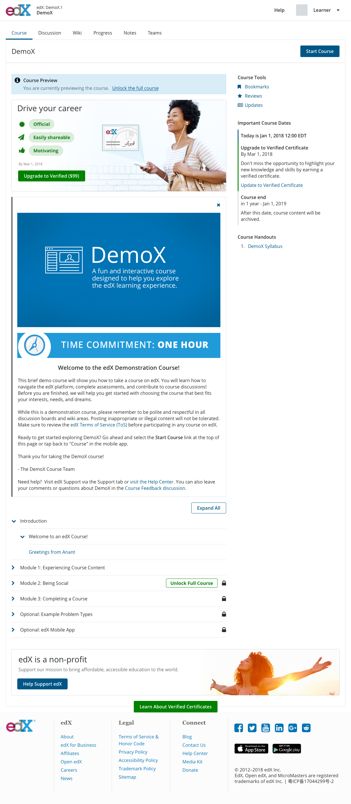
Strategic Context: edX was a nonprofit collaboration between MIT and Harvard, offering massive open online courses (MOOCs) from top universities worldwide. Learners could access all course content for free, with the option to pay for a "verified certificate" that validated completion and, in some cases, provided real college credit.
In 2016, edX struggled to achieve financial sustainability. Leadership assembled a small team of top employees (including me) to tackle this challenge. There were multiple problems:
Limited Understanding: We didn't know why learners chose to pay when they could take courses for free. We had limited data on when, how, and where upgrades occurred.
Visibility Problem: We’d buried the upgrade option in a low-visibility sidebar. Learners saw it before enrolling but had difficulty finding it once the course started. Learners sampled the course for free, but we never reminded them of the benefits of upgrading.
Cultural Sensitivity: Many colleagues joined edX because they sincerely believed in free, open education. Any revenue-generating work had to respect this mission.
My Challenge: Design interventions that would drive meaningful revenue without undermining the mission or alienating learners, all while building our understanding of user motivations from scratch.
The Solutions
Rather than a single redesign, this was a three-year journey of research, experimentation, and iteration. Each year was built on insights from the previous, creating a compounding effect on revenue.
Phase 1 (2017): In-Course Upgrade Visibility
Problem: Learners couldn't find the upgrade option after starting a course. We’d hidden it in a sidebar that users largely ignored.
Process: I mapped all existing upgrade touchpoints and hypothesized that visibility was the primary barrier. Through a series of unmoderated usability tests, I validated that learners were missing the sidebar prompt entirely. I then designed and tested multiple variations of a new "ad-style" prompt, iterating on visual treatments to find the balance between visibility and intrusiveness.
Key Design Decisions:
Placed the prompt on the course overview page, the first page learners see when entering a course.
Designed a "slimmer" prompt that felt native to the experience rather than like an advertisement.
Tested language to ensure clarity of intent: if a learner clicked, they genuinely wanted to upgrade.
Wrote CSS to enable rapid A/B testing through Optimizely.
Result: $5M in additional revenue
The edX UX team
Company-wide presentation
Paper prototyping
Sketching activity with developers
UX strategy workshop
UX showcase
Facilitating brainstorming session
User research “watch & learn”

200+
Iterative optimization
Design reviews
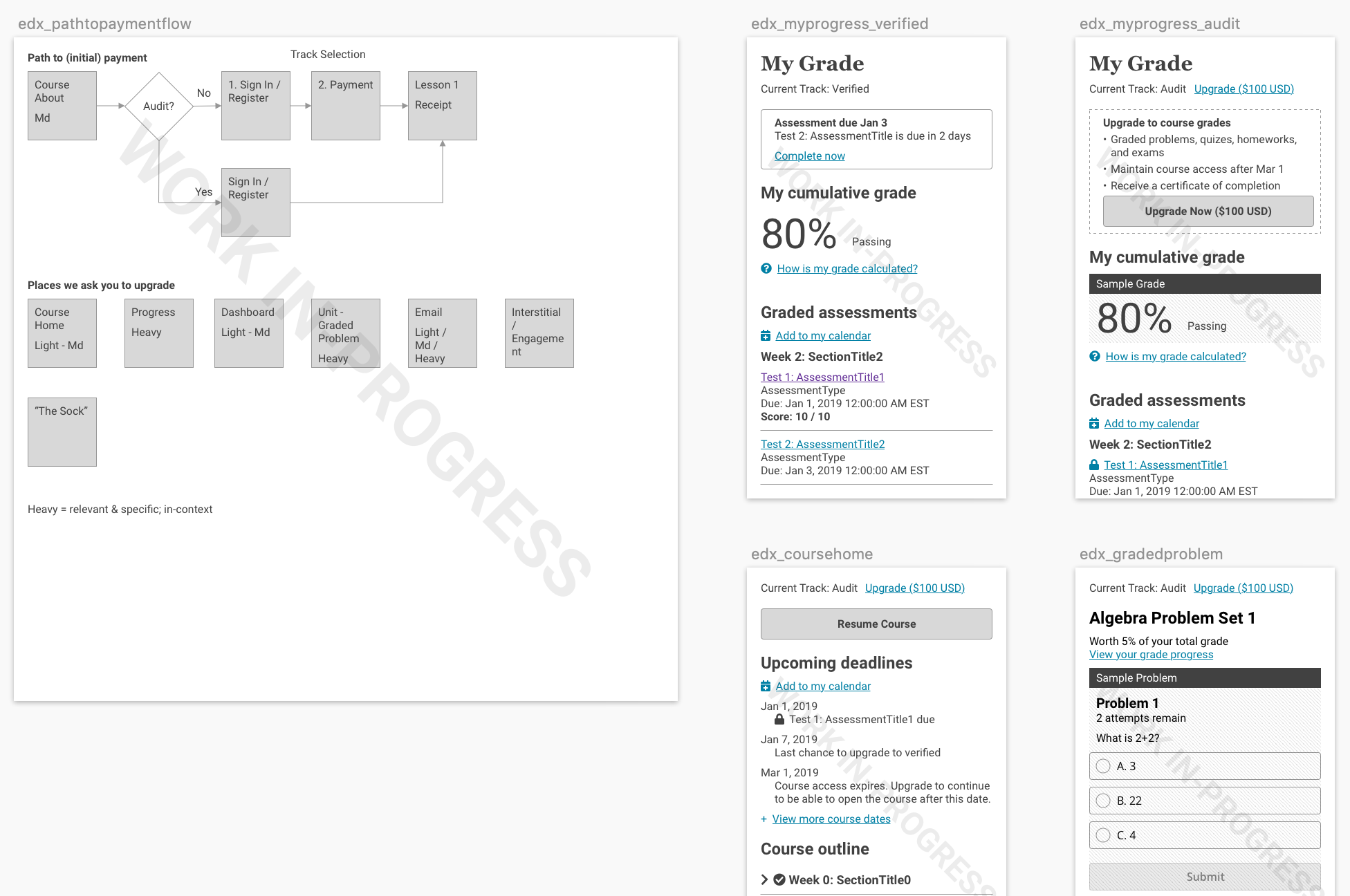
Phase 2 (2018): Re-Aligning the Value Proposition
Problem: The 2017 prompt improved visibility, but conversion plateaued. Learners saw the upgrade option but didn’t feel compelled to act.
Process: I identified learners who had paid for multiple courses and conducted in-depth interviews to understand their motivations. With mentorship from my Head of UX, I ran inherent value testing to uncover why learners chose to pay.
Key Insight: Learners weren't paying for the certificate itself; they were paying for validation and accountability. The certificate proved their knowledge to employers and to themselves. Having money at stake also motivated them to complete the course.
Our existing messaging buried the certificate as the last item in a list of bullet points. We never addressed how learners would use it, nor did we emphasize the prestige of a Harvard or MIT credential.
Key Design Decisions:
Led with prestige and portability, emphasizing that learners could showcase credentials from top universities on LinkedIn.
Standardized the messaging across all upgrade touchpoints for consistency.
Simplified and modernized the visual design while maintaining a native feel.
Result: 35% conversion increase, $12M in additional bookings per user year-over-year.
See/do diagramming
Phase 3 (2019): New Revenue Model
Problem: Despite gains, edX still wasn't on track for long-term sustainability. Leadership asked us to explore new revenue approaches beyond optimizing the existing model.
Process: Before exploring new territory, I needed to address the team's concerns about charging learners. I created and facilitated an "evil-storming" workshop where we brainstormed the most exploitative ways to generate revenue. This exercise (in a fun, approachable format) surfaced our hard limits and identified safer zones for experimentation. The conversation permitted the team to innovate without compromising values.
Through additional research, I discovered that paid learners were more likely to complete courses. The reverse was also true: learners who fell more than a week behind rarely upgraded. Courses already had an upgrade deadline, but many of our learners never came close to reaching it.
Key Design Decisions:
Deadline Awareness: Added dynamic, date-based deadlines to all upgrade messaging. Created a "congratulations" page at the end of week one, timed to a positive feedback loop, with a call to upgrade and stay on track.
New Graded Content: Introduced new graded assignments that required TA review, available only to verified learners. Free learners saw a preview with a lock icon and could skip to continue learning. However, we didn’t remove any existing course content.
Transparent Constraints: Clearly explained why graded content required payment (TA capacity), so learners understood the value exchange.
Result: $20M+ projected sustainable annual revenue increase.
Collaborating with developers
Visual specifications
Impact
Business Results:
$37M+ in attributable revenue over three years:
$20M+ projected sustainable annual revenue (2019)
$12M increase in bookings per user year-over-year (2018)
$5 additional revenue (2017)
35% increase in upgrade conversion (2018)
Learner Results:
Non-intrusive prompts that respected the learning experience
Clear, honest messaging about the value of verification
No reduction in free access: all learning content remained open
WCAG 2.0+ compliant designs throughout
Organizational Impact:
Established research as the foundation for product decisions
Created frameworks for navigating mission-sensitive revenue conversations
Built team confidence in experimentation through a transparent process
Key Takeaway
Research unlocks ethical revenue.
When I started this work, the team was uncomfortable with the idea of "optimizing for revenue" at a mission-driven nonprofit. By grounding every decision in user research, I demonstrated that revenue and mission weren't in conflict. Learners wanted validation and accountability; we just needed to communicate the value clearly and make the option visible.
The evil-storming workshop was pivotal. It gave us a shared understanding of what we would never do, which freed the team to explore what we could. The result wasn't just $37M+ in revenue, it was a sustainable approach to experimentation that respected both learners and colleagues.
This project taught me that the most impactful design work often begins with understanding motivations, not only users' but also the teams building the product.
